

A choir director often lands on purple and gold the same way people choose a hymn for a major service. It feels weighty, beautiful, and right. Then the practical questions start. Will it look too formal for weekly use? Will gold glare under sanctuary lights? Will the youth choir and adult choir still look unified if their cuts and sizes differ?
Those are smart questions. Purple and gold choir robes can look dignified and memorable, but they work best when you choose them with the whole setting in mind. Color meaning matters. Fabric finish matters just as much. Fit matters more than many buyers expect.
Introduction to Purple and Gold Choir Robes and Why They Stand Out
A lot of directors start with a simple problem. The current robes look tired, Easter is coming, and the choir needs something that feels more special than black or navy. Purple and gold usually enters the conversation because it looks ceremonial without feeling cold. It carries presence the moment singers walk in.

Many directors first explore this palette while comparing church choir robes for different worship settings. That's usually where the decision begins. Purple and gold isn't just a prettier version of a neutral robe. It sends a clearer visual message.
Why this color pairing catches attention
Purple reads as deep and serious from a distance. Gold catches light and marks out important details. Together, they create contrast in the same way a strong anthem pairs quiet verses with a bright refrain. One color grounds the ensemble. The other lifts it.
That's why these robes often feel more intentional than plain black, maroon, or navy. Neutrals are dependable. Purple and gold is interpretive. It says something before the first note is sung.
The buyer question most articles skip
Most articles stop at symbolism. Buyers usually need more than that. They need to know whether this palette will work in ordinary Sundays, memorial services, school performances, graduations, and touring appearances.
Purple and gold can be an excellent choir choice, but it isn't automatically the safest choice for every calendar, every denomination, or every platform.
If you're weighing robes for mixed use, think of this guide as a decision aid. It helps you answer four practical questions:
- Meaning: What do these colors communicate in worship and performance?
- Material: Which fabrics keep purple rich and gold controlled under light?
- Styling: Should gold be a trim, yoke, stole, or a larger panel?
- Fit and ordering: How do you keep the whole ensemble looking uniform across age ranges and body types?
What Purple and Gold Symbolize in Worship and Performance
A director choosing purple and gold is usually asking two questions at once. What will these colors mean to the congregation, and will they feel right often enough to justify the purchase?
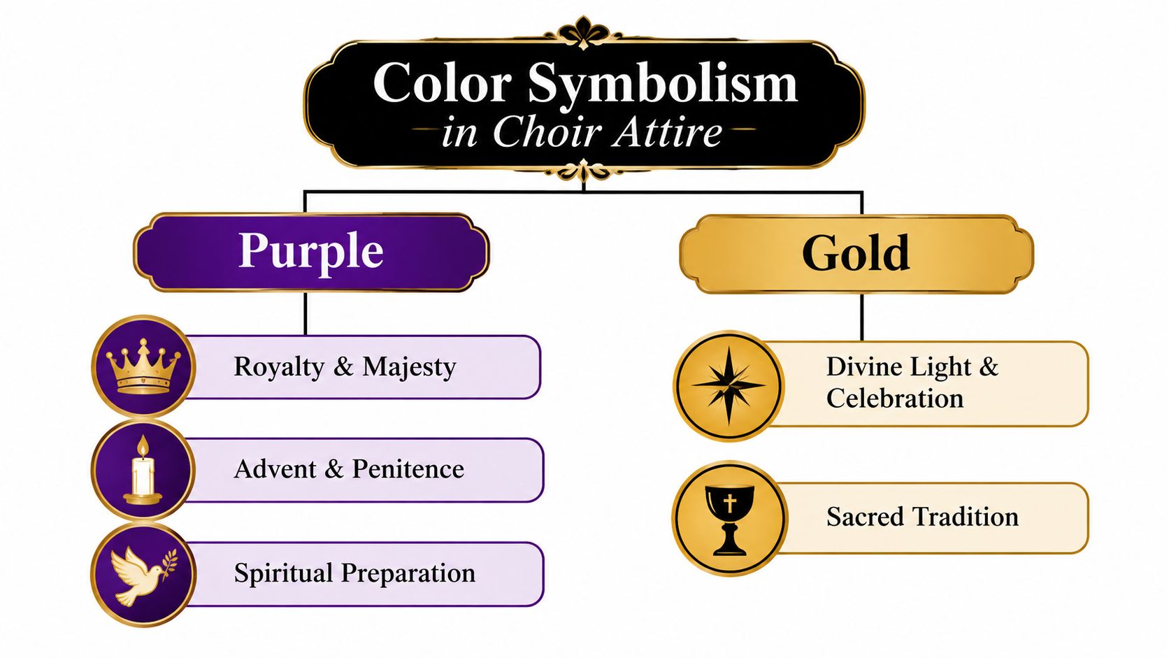
Purple and gold stand out because they carry meaning before the choir sings. In many Christian traditions, purple or violet is tied to Advent and Lent, while white or gold is tied to Christmas and Easter. The same church reference also explains that the liturgical color system was standardized in 1570 in the Roman Catholic Church, and that purple had already gained royal associations in the Roman world because the dye was costly, as outlined in this Presbyterian guide to signs and symbols in worship.
Purple carries both dignity and reflection
Buyers sometimes hesitate here because purple can feel royal and solemn at the same time. That is normal, not confusing. In worship settings, purple often signals preparation, repentance, depth, and reverence. In performance settings, the same color can read as formal, serious, and musically weighty.
Gold changes the message. EWTN's explanation of liturgical vestment colors connects gold with joy, light, and major feast days. Put beside purple, it softens the penitential side and adds celebration.
The result is easy to read from the pews. Purple grounds the ensemble. Gold marks what matters.
Designers use that same visual logic in other ceremonial products. Deep purple suggests richness, while metallic gold signals importance, which is why premium metallic foil packaging feels formal before it is even opened. On choir robes, the effect is similar. The pairing reads as ceremonial before a note is sung.
The real buyer question is seasonal range
Symbolism matters, but calendar use matters just as much. Purple and gold can be an excellent choice for choirs that sing during high holy days, concerts, anniversaries, convocations, and formal services. It is often a stronger fit for programs that want a clearly sacred or ceremonial look than for choirs that need one robe color to cover every ordinary Sunday, memorial, school event, and community appearance.
That is where directors need judgment. A deep purple robe with restrained gold trim usually works across more dates than a robe with large metallic gold panels. The first reads formal and versatile. The second reads distinctly festive.
Tradition changes the answer
Color language is not identical in every church body. Some traditions use gold broadly for feast days and ordinary celebratory use, while reserving purple more narrowly for penitential seasons. That means the same robe may feel year-round in one setting and season-specific in another.
For ecumenical choirs, touring groups, and school ensembles, it helps to treat purple and gold as visual language rather than fixed code. Purple suggests authority, seriousness, and depth. Gold suggests ceremony, warmth, and brightness. Together, they can be beautiful. They are less neutral than black, navy, or burgundy.
If you want a broader guide to how robe colors read across seasons and messages, this overview of choir robe color meaning by season and message is a helpful next reference.
Choosing Fabrics and Finishes That Make Purple and Gold Shine
The same purple and gold can look noble, flat, glaring, or muddy depending on fabric. That's why color choice alone isn't enough. Fabric finish controls how the robe reads from the pews, on livestream, and in photos.
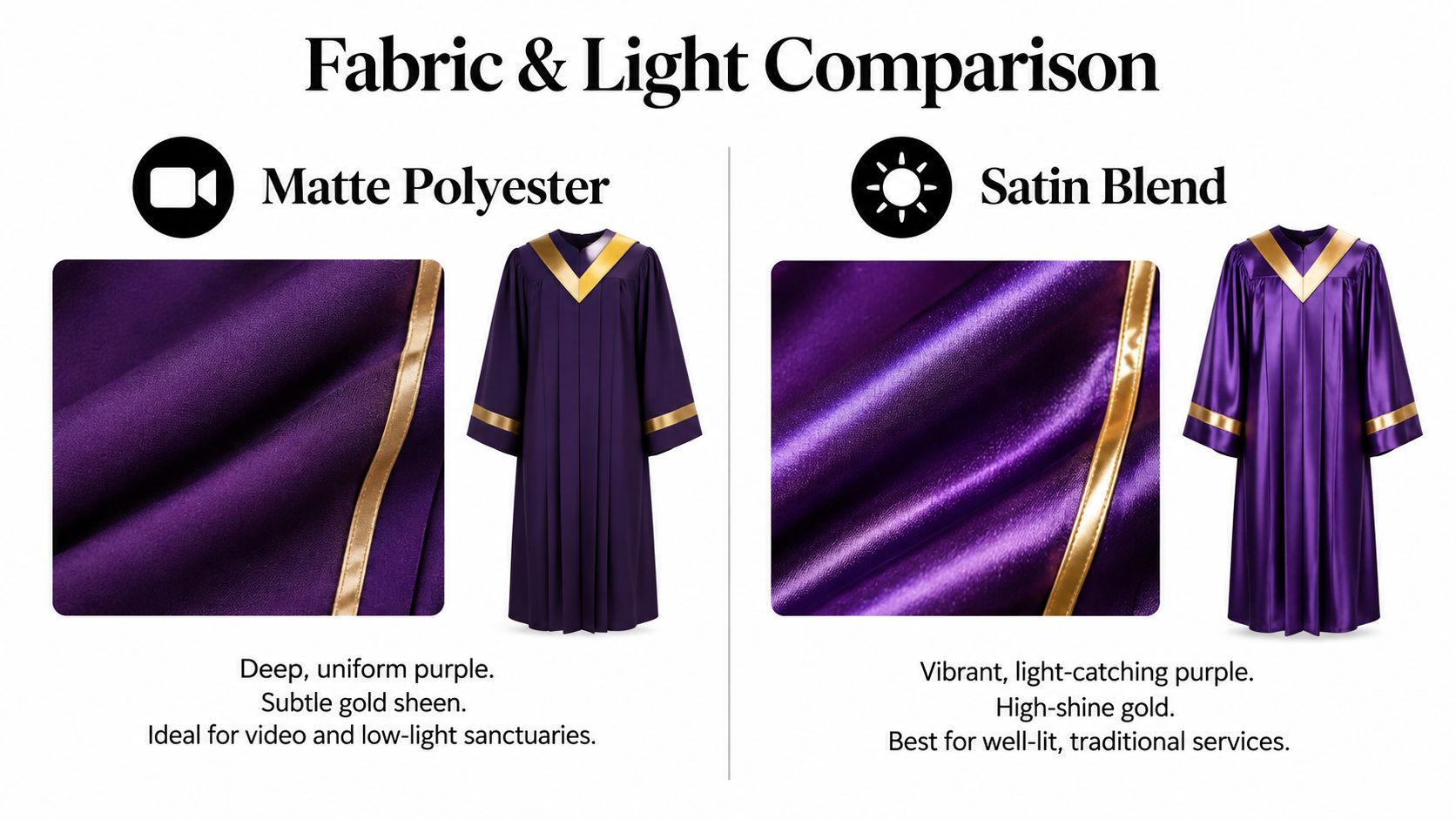
Textile guidance for choir apparel repeatedly describes polyester as retaining color, resisting wrinkles, and holding up under regular laundering. It also notes that matte polyester gives a deep, uniform appearance, while shiny or satin polyester increases vibrancy and light-catching sheen, as discussed in this choir robe fabric and color guide.
Matte versus satin under real lighting
Think of matte polyester like a painted church wall. It absorbs and steadies light. Satin acts more like polished brass. It reflects and announces itself.
That changes how each color behaves:
| Finish | What purple tends to do | What gold tends to do | Best use case |
|---|---|---|---|
| Matte polyester | Looks deep and even | Stays controlled | Sanctuaries, video, frequent weekly use |
| Satin or shiny finish | Looks brighter and more vivid | Catches more light | Well-lit services, formal presentations |
Purple is a visually dense color. If the fabric is weak or overly harsh in finish, it can look dull. Gold needs even more care because too much reflectance can turn elegance into glare.
What to ask for before ordering
Many buyers rely on swatches alone. That helps, but it's not enough. Ask for documented laundering and color performance, not just a statement that the robe is durable.
Practical rule: Don't approve a purple-and-gold robe from appearance alone. Ask how the fabric holds color after repeated washing and exposure to light.
Another textile source notes that piece-dyed polyester is more colorfast than cotton-poly blends, and solution-dyed fabrics can keep colors from fading with little variance over time, according to this material guidance for choir robes.
Use that idea as a simple checklist when comparing robes:
- Ask about colorfastness: Request wash, light, and crocking performance details if available.
- Check the finish under your lighting: Sanctuary chandeliers, LED stage lights, and daylight all treat gold differently.
- Look at distance, not just hand feel: Have someone hold the sample several rows away.
- Match use to finish: Weekly choirs often prefer restraint. Festival choirs may want extra sheen.
If you're comparing robe construction options more broadly, this guide to the best choir robes for different ensemble needs is a useful starting point.
Styling Your Ensemble With Stoles Cassocks and Gold Accents
Color tells one story. Styling tells the rest. A full purple robe with a small gold accent feels very different from a robe with wide gold panels, a bright stole, or a contrasting yoke.

A strong design principle from liturgical and choral styling is simple. Use purple as the visual anchor and gold as the signal. Because gold is reflective, it usually works better as trim, stoles, yokes, or emblems than as large uninterrupted coverage when you want controlled brightness rather than maximum shine. That relationship is discussed in this historical and liturgical overview of church vesture and color use.
Three common styling paths
Path one is the restrained formal look. Use a purple robe body with narrow gold trim or a gold yoke. This works well when the choir needs to look ceremonial but not flashy.
Path two is the seasonal lift. Keep the base robe primarily purple and add a gold stole for major services, concerts, or feast days. This gives you visual flexibility without changing the full wardrobe.
Path three is the layered liturgical approach. For some teams, cassock-and-surplice combinations or robe-plus-stole combinations offer better control over formality. Gold appears in the accessory, not the entire garment.
When more gold helps and when it hurts
More gold can be useful when the choir performs in a large room, on a dim platform, or at a special event where visibility matters. It can be too much in memorial settings, mixed-season calendars, or spaces where the altar colors already do most of the symbolic work.
A practical comparison helps:
- Gold trim: clean, structured, easy to live with year-round
- Gold stole: adaptable for high days and concerts
- Gold yoke: frames faces well and reads clearly from a distance
- Large gold panels: strongest visual impact, least subtle option
A robe doesn't have to use more gold to feel more important. Often the most dignified look comes from careful placement, not more surface shine.
If you're choosing overlays and accent pieces, choir stoles in seasonal and custom styles are often the most flexible way to make purple and gold work across multiple services.
Finding the Right Fit With Inclusive Sizing for Every Choir Member
Even a beautiful color scheme falls apart if the robes don't fit well. Purple and gold tend to make fit problems more obvious because the colors draw attention. A hem that's too short, sleeves that pull, or a robe that collapses at the shoulders can make the entire ensemble look uneven.
Why letter sizes don't solve choir fit
Many choirs still try to order by simple S, M, L, and XL logic. That's rarely enough for a mixed ensemble. Better fit usually means checking chest, waist, hip, height, sleeve length, plus petite and tall needs, especially when adults, youth, and different body shapes are all in one group.
Published buyer guidance on church apparel points out that sizing is moving toward broader ranges and more inclusive silhouettes, and that fit now matters as much as color for a polished final look, as discussed in this guide to choosing church choir uniforms.
A practical sizing reference
One published size chart for church apparel shows how broad real choir sizing can be. It lists women's sizes from 4 through 32W, with bust measurements from 34.5 inches up to 63 inches, which gives a clear picture of why inclusive ordering matters in group purchases, according to this extended choir apparel size chart.
| Size Range | Bust Measurement | Fit Consideration |
|---|---|---|
| 4 through standard sizes | Starts at 34.5 inches | Useful for smaller adult frames when robe volume is controlled |
| Mid-range standard to plus transition | Varies by maker | Often where shoulder width and sleeve drape need extra attention |
| Extended plus sizes through 32W | Up to 63 inches | Best handled with cut options that preserve length and movement, not just extra width |
How directors keep the look uniform
The goal isn't to make every singer the same shape. The goal is to make the ensemble read as one group.
Use this process:
- Measure before discussing style changes. Height-only ordering often creates the most visible mistakes.
- Separate youth from adult assumptions. Children's sizing and shorter statures need their own plan.
- Check robe length in seated and standing positions. A robe can look fine in rehearsal and awkward in the loft.
- Ask about petite and tall options. Sleeve and center-back length affect symmetry across a row.
Some retailers, including options in ChoirBuy's main store, offer choir apparel categories that support custom ordering and broader size runs, which can help when a choir needs one visual standard across many body types.
Customization Bulk Ordering and Timelines Made Simple
A director often realizes the challenge late. The colors are chosen, the choir likes the look, and then practical questions show up all at once. Will purple and gold still feel right for the spring concert? Will the gold look rich under stage lighting or flat and shiny? Can the order be finished in time without rushing size checks?
A group order works best when you handle it in stages. First decide where the robes will appear most often. Then confirm the design. After that, approve a sample or swatch. Only then is it wise to place the full order.
A practical ordering plan
Start with use, not decoration. Purple and gold can look beautiful in worship settings, holiday programs, and formal concerts, but they are not the most flexible choice for every calendar. If one robe must cover solemn services, school events, community performances, and memorials, a more neutral base color may serve the choir better. In that case, purple and gold often work best as removable accents rather than permanent panels.
That question saves trouble later. A robe color functions a lot like paint in a sanctuary or auditorium. The same shade can feel rich and dignified in one room, then heavy or overstated in another.
An outside guide on choosing choir uniforms makes a similar point. Color should match the setting as well as the message, and darker shades are often selected for visual weight as much as symbolism, according to this discussion of how to choose choir uniforms.
What to approve before the full order
Put every decision in writing so the choir office, vendor, and leadership team are all looking at the same plan.
- Color role: Will gold appear as trim only, or as a yoke, stole, cuff, or front panel?
- Season range: Is this robe meant for a few key services, or for year-round use across mixed events?
- Fabric finish: Do you want a matte finish that looks restrained in bright light, or a slight sheen that helps gold accents read clearly from a distance?
- Stage appearance: Will the robe be seen mostly in natural sanctuary light, livestream video, or strong concert lighting?
- Approval method: Are you signing off from a photo, a swatch, or a physical sample robe?
Fabric finish deserves more attention than many buyers expect. Purple can look deeper on a matte fabric, while gold can shift from elegant to flashy if the finish reflects too much light. A small swatch check under your actual lighting can prevent that mismatch.
Timelines that protect your event date
Choirs run into avoidable problems when robes are ordered like last-minute supplies. Custom garments take time because color, trim, sizing, production, and shipping all have to line up.
Order from the service date backward, not from today forward.
Ordering backward from the service date usually leaves enough buffer for swatch checks, sample approval, and size corrections before the busiest part of the season. That is especially helpful when a choir is deciding between a fixed purple-and-gold design and a more versatile robe with interchangeable accents.
If your choir needs one system that can handle many occasions, versatility often wins. Purple and gold still have a place. They look best when the calendar, fabric finish, and ordering timeline all support the choice.
Caring for Purple and Gold Robes to Keep Colors Vibrant
Once the robes arrive, maintenance determines how long they keep their impact. Purple can lose depth if the fabric fades. Gold can lose its crisp look if trim wrinkles or the finish degrades.
Wash for color first, not convenience
Polyester is popular for choir robes because it resists wrinkles and handles regular laundering well. That doesn't mean every polyester robe behaves the same. Colorfastness still matters, and as noted earlier, piece-dyed polyester and solution-dyed fabrics are useful signs to watch when you want the color to hold over time.
A simple care routine works well:
- Wash with consistency: Use the care instructions from the seller and keep the routine the same for the full set.
- Separate trims when needed: If stoles or overlays have different finishes, don't assume they should be cleaned exactly the same way as the robe body.
- Hang promptly after cleaning: That helps preserve shape and reduces wrinkle setting.
- Inspect before storage: Look for stress on seams, neckline wear, and loose gold accents.
Storage matters more than many choirs think
A robe closet can either preserve garments or slowly damage them. Crowding causes wrinkling. Bright storage areas can contribute to fading. Poor hanging support can distort shoulders.
For teams that want a straightforward refresher on how to keep polyester garments vibrant, that laundering guide is a useful companion to the manufacturer's own care directions.
Good care is mostly repetition. Clean the robes the same way, store them the same way, and inspect them before each major season. That routine protects the visual authority purple and gold is meant to carry.
If you're comparing purple and gold choir robes, stoles, cassocks, or custom options for a full ensemble, ChoirBuy offers choir apparel in multiple colors, fabric finishes, and inclusive sizing categories. It's a practical place to review robe styles, accent options, and bulk-order choices so your final look fits both your calendar and your platform.