

A music director stands in front of a wall of fabric swatches, holding burgundy in one hand and crimson in the other. The coffee beside the order form has gone cold, rehearsal starts soon, and the choice suddenly feels larger than a question of taste. One shade may look dignified in the sanctuary, while the other turns orange under stage lights or disappears into a livestream background.
A useful choir robes color guide connects tradition with practical decisions. The right color can signal the season, support your church or school identity, remain readable from the balcony, and keep a large ensemble visually consistent in photographs. It can also prevent expensive mistakes when you reorder robes later.
Why Color Matters More Than You Think
Color speaks before the choir sings. A congregation may not consciously name the shade of a robe, but people notice whether the ensemble looks prepared, whether the garments suit the service, and whether the group appears unified.
The director choosing between burgundy and crimson isn't only deciding between two attractive reds. The decision includes the sanctuary's wood and stone, the warmth of the lighting, the school crest, the church calendar, and the way the choir will appear on a phone screen. A color that works beautifully in person can lose its character when a camera compresses shadows or when a bright window sits behind the singers.

Meaning comes first
Church robe colors carry inherited meaning. Medieval church practice identified a Roman palette of white, red, black, and green by the late 12th century, and later standardization connected colors with seasons and services. That history still shapes the choices directors make today, especially when purple suggests Advent or Lent, white suggests Christmas or Easter, red points toward Pentecost or martyrdom, and green belongs to Ordinary Time. The history of choir robe color meaning offers useful background for directors who want their purchasing decisions to respect that tradition.
A base robe can also support several services without forcing the choir to replace its full wardrobe. Seasonal stoles, yokes, piping, or other accents can introduce a liturgical color while the main garment remains consistent.
Visibility matters too
A robe must work at the back of the room, not only in the fitting area. A deep shade may look elegant close up but merge with dark wood or a black stage curtain. A pale shade may look joyful in daylight yet lose its edges under bright camera exposure.
Color affects:
- Worship communication: The hue can reinforce the season and theological emphasis.
- Stage presence: A coherent ensemble gives the audience a clear visual shape.
- Photography: Mid-tone colors usually retain more visible detail than extreme light or dark shades.
- Brand identity: Trim or piping can echo a school or parish palette without making the entire robe look like casual promotional apparel.
- Future purchasing: A documented color choice reduces confusion when another coordinator handles the next order.
Practical rule: Choose the robe color in the room where the choir performs, under the lighting the choir actually uses.
The strongest choice balances symbolism, visibility, comfort, and repeatability. That makes color a functional part of the uniform rather than a decorative decision made from a computer screen.
The Six Core Liturgical Colors and What They Signal
The six core colors most often discussed in a liturgical choir robe color guide are white, red, green, purple, rose, and black. Their use can vary by denomination, diocese, parish, or congregation, so clergy should approve the final rotation before a choir places a large order.
Start with the church calendar
White or gold generally supports Christmas and Easter, where the visual message is purity, celebration, and rejoicing. Red is associated with Pentecost, martyrs, and Passion observances, carrying associations of fire, blood, courage, and sacrifice.
Green belongs to Ordinary Time and communicates life, growth, and hope. Purple or violet is connected with Advent and Lent, making it suitable for seasons of preparation, penitence, and reflection. Black or purple may be used for funerals and services for the dead, while rose is reserved for Gaudete and Laetare Sundays as a brief visual change within penitential seasons. These season-to-color relationships are summarized in the guide to liturgical vestment colors.
| Color | Season or Use | Suggested Stole Accent |
|---|---|---|
| White or gold | Christmas, Easter, festive celebrations | Gold, white, or seasonal embroidery |
| Red | Pentecost, martyrs, Passion observances | Red over white, or white with red trim |
| Green | Ordinary Time | Green with restrained gold or white detail |
| Purple or violet | Advent and Lent | Purple over a neutral base |
| Rose | Gaudete and Laetare Sundays | Rose over white, purple, or a neutral robe |
| Black or purple | Funerals and services for the dead | Black, purple, or subdued silver detail |
A choir with a neutral base robe can use stoles to create seasonal distinction. For example, a white robe may pair with purple during Lent, red during Pentecost, and green during Ordinary Time. The stole should complement the garment's cut and fabric weight, since a very shiny accent can make a matte robe look mismatched.
Distinguish tradition from customization
Black, navy, royal blue, maroon, and deep purple remain dependable choices for choirs that need a formal appearance outside a strict liturgical rotation. Historical church attire was once much narrower, with black, white, and blue dominating European choir and church garments into the early 20th century. The broader palette available today gives directors more flexibility, but it doesn't erase local convention.
A clergy team may follow vestment rules more closely than a concert choir, and the difference matters. Review your congregation's practice with the priest, pastor, worship leader, or diocesan office. The resource on vestments for clergy can help clarify how choir garments relate to the wider service wardrobe, but local guidance should decide the final shade and schedule.
How Fabric and Light Change the Color You See
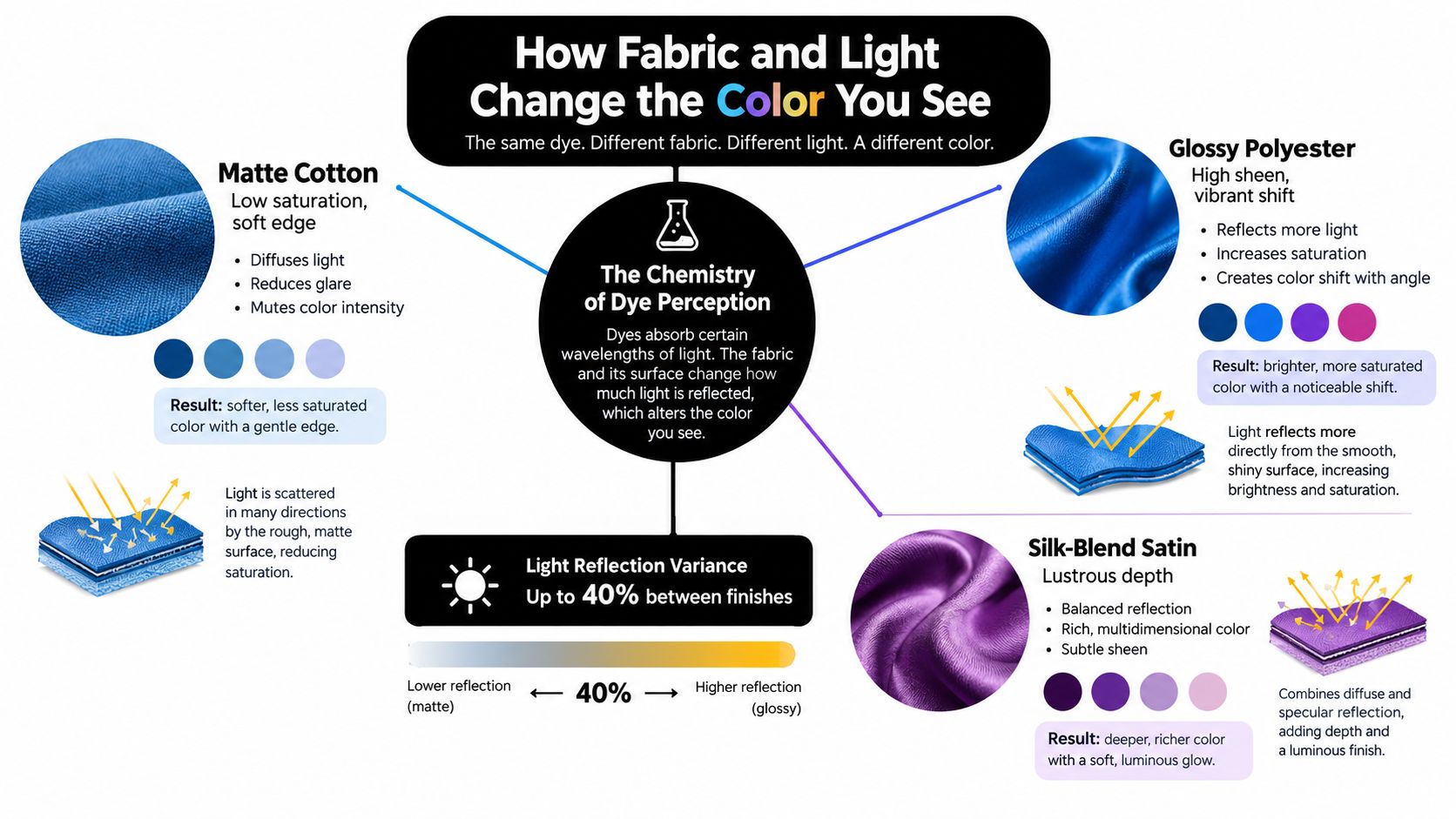
A swatch shows a color, but it doesn't show the entire robe experience. The same dye can appear softer on matte fabric, more intense on glossy polyester, or deeper on a satin surface because the weave and finish change how light reaches the eye.
Matte cotton scatters light across a relatively soft surface. Glossy polyester reflects more directly, which can make a color appear more vivid while also producing highlights that obscure detail. Silk-blend satin creates a lustrous effect that may look rich in a fitting room and much brighter under a spotlight.
Read the finish, not just the dye
Fabric finish changes perceived saturation, depth, and contrast. Thread construction, weave density, and surface texture all influence whether the eye reads a robe as crisp, soft, bright, or muted.
A bright royal blue can look nearly black in dim sanctuary lighting. Pale gold may lose definition when a camera raises exposure, while deep purple can take on a brown cast under harsh side lighting. Those changes don't mean the dye is defective. They show why a color needs testing in its final environment.
The fabric-by-the-yard resource for religious garments is useful when you want to compare material options before committing to a finished robe.
Protect the color over time
Colorfastness means the dyed fabric resists fading or running during washing, rubbing, sweating, and light exposure. Choir robes face all of those conditions through repeated services, handling, stage lighting, and laundering, so color stability affects whether the ensemble still matches after regular use. Durable polyester and polyester blends are widely used for church choir attire because they resist wrinkles, simplify care, and tend to retain color better than delicate specialty fabrics. Confirm both wash fastness and lightfastness before a bulk purchase.
A beautiful color that changes from robe to robe won't create a unified choir.
Look for enough contrast between the robe and the background, but avoid a finish so reflective that it creates glare. A moderate sheen can add life on stage, while a matte surface often gives a calmer and more predictable result for photography.
Matching Color to Your Choir's Identity and Setting
A choir uniform should belong to its setting without disappearing into it. Start by examining the sanctuary, school auditorium, or concert venue. Note the dominant wood tones, stone, drapery, organ pipes, flooring, banners, and backdrop. A robe color that complements those elements will look intentional, while a competing shade can appear muddy or disconnected.
School and parish identity deserve attention too. A choir may need to acknowledge a crest or institutional palette, but the body of the robe doesn't have to reproduce every brand color. A classical navy, burgundy, white, or royal blue body can carry a narrow trim, piping detail, or stole in the organization's accent color.
Build the palette in the performance space
Livestreaming adds another test. Warm tungsten light can push reds toward orange. LED panels may deepen or flatten blues, and a very dark robe can lose folds and sleeve detail against a dark background. Pale lavender or light gold may look delicate in person but become weak on a bright screen.
Use a simple room audit:
- Hold the swatch beside the altar, riser, or stage backdrop.
- View it from the congregation's seating area and from the balcony or loft.
- Test it under the actual sanctuary lights, not only daylight.
- Record a short phone video from the livestream position.
- Compare the result with the choir's school, parish, or event branding.
Traditional colors such as black, burgundy, royal blue, red, purple, white, and forest green coordinate easily with many sanctuary and school palettes, but a side-by-side test is more reliable than a color name. Uniform options for choirs can help you compare robe styles and coordinated details while you develop that palette.
| Setting | Light Source | Effect on Color | Recommended Adjustment |
|---|---|---|---|
| Traditional sanctuary | Warm interior lighting | Reds may appear warmer and dark blues may lose detail | Test a mid-tone blue or restrained burgundy |
| School auditorium | Mixed overhead and stage lighting | Colors may look uneven across the group | Choose a stable finish and test from the audience |
| Livestream platform | LED panels and camera exposure | Pale colors may wash out and dark colors may merge with the background | Favor clear mid-tones with visible contrast |
| Concert venue | Strong front lighting | Glossy fabric may create bright reflections | Consider a matte or moderate-sheen fabric |
| Backlit sanctuary | Windows or stained glass | Robe edges can disappear into bright areas | Use a stronger mid-tone and avoid very pale shades |
The best color story works in person, in photographs, and on video. Test the actual swatch before approving the final design.
Choosing Colors for Adult, Youth, and Clergy Groups
Different groups need different visual solutions, even when they share one platform. Adult singers often suit deeper, saturated colors such as burgundy, royal blue, or forest green because those hues create a formal appearance without relying on ornate decoration.
Youth choirs can use brighter mid-tones that feel energetic while remaining coordinated with the senior ensemble. Their robes should also tolerate frequent handling and laundering. A director might keep the same general color family across age groups, then distinguish the youth group with a brighter stole, contrasting piping, or a lighter accent.
Clergy and directors usually need garments that sit within the service's established vestment system. Black, white, and seasonal liturgical colors are common foundations, while heavier fabric and more formal trim can separate leadership garments from choir attire.
| Group | Typical Color Range | Fabric Weight | Stole Pairing | Notes |
|---|---|---|---|---|
| Adult choir | Burgundy, royal blue, forest green, black, or seasonal colors | Durable medium-weight fabric | Seasonal or coordinated stole | Prioritize formal appearance and consistent photography |
| Youth choir | Clear mid-tones, brighter blue, red, green, or white | Lightweight, washable fabric | Simple contrasting stole or trim | Make movement and easy care part of the decision |
| Clergy or directors | Black, white, purple, red, green, or other approved liturgical hues | More structured or substantial fabric | Liturgical stole with appropriate detail | Confirm the color rotation with clergy or denomination |
| Combined platform | Related base colors with controlled accents | Consistent finish across groups | Shared accent color | Keep the full service visually connected |
The goal isn't to make every group identical. It's to create a hierarchy that helps the congregation understand the platform at a glance. One group can carry the dominant color, another can use a related tone, and clergy can retain the garments proper to their role.
For unusual costume concepts, seasonal productions, or theatrical presentations, a resource such as this ultimate faux fur robe guide may help you think through texture and visual impact. That kind of garment belongs to a different setting than a standard liturgical robe, so keep the service's formality and movement requirements in view.
Testing Colors with Swatches and Samples Before You Buy
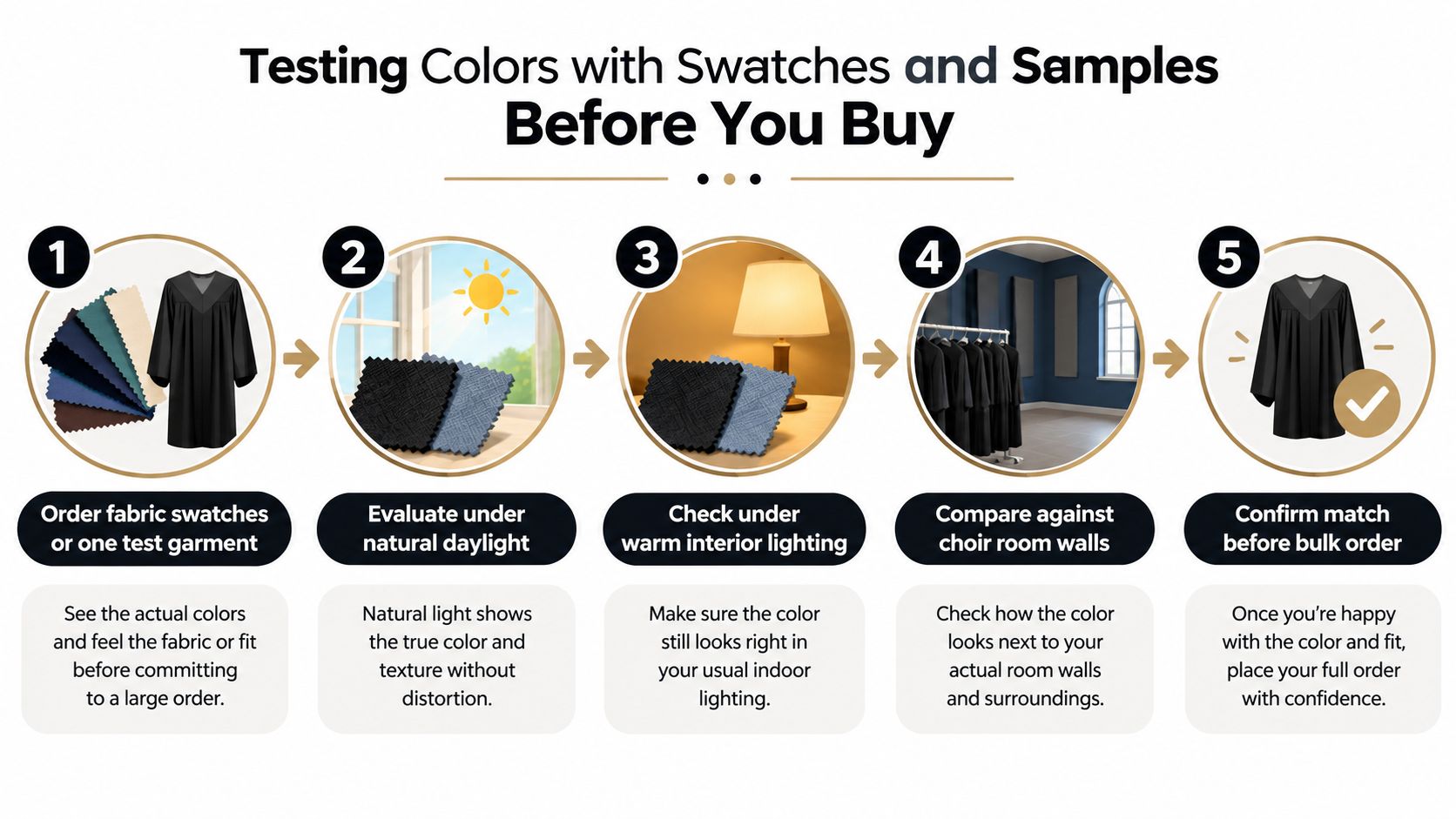
The safest color decision begins with a physical sample. Screens vary, names such as “royal blue” cover a range of shades, and fabric finish can change the way a dye reflects light.
Order fabric swatches first, then consider a single test garment if the budget and supplier allow it. A finished robe reveals details a flat swatch can't show, including the effect of sleeves, pleats, yokes, lining, and the way the fabric hangs on different bodies.
Use the same test in every important environment
Evaluate the sample in natural daylight, sanctuary lighting, and stage LED lighting. If the choir performs in a room with stained glass or strong backlighting, place the garment where that effect is visible. Look at it from the congregation's perspective, from the loft, and through the camera used for livestreaming.
Ask two singers with different complexions and body shapes to wear the sample during a full rehearsal. This doesn't turn color preference into a rigid rule about skin tone. It gives the director a practical view of contrast, glare, fold definition, and visual consistency across a diverse ensemble.
Check the robe against:
- Skin tones: Does the color provide clear separation without creating an unwanted cast?
- Room surfaces: Does it stand apart from wood, stone, curtains, and banners?
- Printed materials: Does it compete with hymnals, folders, or music stands?
- Backlighting: Can viewers still see the sleeves and shoulders?
- Camera view: Does the shade retain its character on a phone or livestream image?
Document the approved sample
Photograph the garment under each relevant light source. Keep the approved swatch with the purchase records and note the fabric, finish, trim, and supplier description. Dye consistency matters because visible shade variation can develop across an ensemble when garments come from different production batches or when future additions don't match the original order.
Don't approve a bulk order from a sample viewed only at a desk. Let singers, clergy, and the person responsible for livestreaming review the final images. A short rehearsal test can prevent a much larger wardrobe problem.
Ordering Tips for a Uniform Look Across the Ensemble
Uniformity starts with purchasing discipline. Once the color and fabric are approved, create a record that another coordinator can understand without relying on memory.
Protect the main order
Request a single dye lot for the full order whenever possible. Ask the supplier to confirm how future reorders will be handled, since a later production batch may not look identical even when the listed color name remains the same.
Measure every singer rather than estimating from a headcount. Record height, chest, sleeve needs, and any fit considerations in one spreadsheet. A size run should reflect the actual ensemble, not a convenient assumption that everyone can wear the same cut.
Ask about package options that combine robes, stoles, and closure details. Bundling related pieces can simplify color matching, but review the physical samples and written specifications before approving the package.
Ordering note: Keep one approved robe or swatch as the physical reference for every future replacement.
Plan for continuity
Order some reserve garments when your budget and supplier allow it, especially if the group changes regularly or performs in demanding conditions. The exact quantity depends on enrollment, turnover, storage, and the risk of damage, so make the decision from your own records rather than applying a universal percentage.
Keep the following information together:
- Color record: Supplier color name, approved swatch, fabric finish, and any trim color.
- Production record: Dye lot information and the date of the order.
- Sizing record: Singer measurements and the size assigned to each person.
- Care record: Washing, drying, pressing, and storage instructions.
- Policy record: Return terms, replacement options, and the process for future matching.
- Budget record: Package contents, alterations, shipping, and any customization.
Ask when the robes will arrive, what happens if an unopened garment must be returned, and whether the supplier can help match a later addition. Store the spreadsheet with the approved sample so a new wardrobe coordinator can reorder confidently.
Putting the Pieces Together into Your Final Palette
A working robe palette is a small system, not a single color. Begin with the base garment, chosen from liturgical practice, school identity, parish tradition, or the needs of the performance venue. Then add seasonal stoles or accents, test the full combination under sanctuary and camera lighting, and document the approved fabric before ordering.
Your palette file might include one base robe, several seasonal stole options, a photographed swatch, sizing records, and care instructions. The exact mix depends on your calendar and budget. What matters is that every future decision refers back to the same physical and visual standard.
Color inspiration from outside church apparel can still be useful. A guide to bright color bouquets can help you study complementary hues and accent relationships, even when your final choir palette remains more restrained.
Start with one swatch. Hold it in the sanctuary, place it in front of the camera, ask singers to wear the sample, and let tradition, visibility, fabric performance, and long-term ordering needs shape the final choice.
ChoirBuy offers choir robes, stoles, and related garments in multiple colors and fabric options, with sizing and customization resources for adult, youth, and liturgical ensembles. Visit ChoirBuy with your approved swatch and service calendar ready, then compare options that can keep the whole choir visually consistent.